It’s just so Richmond
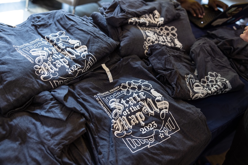
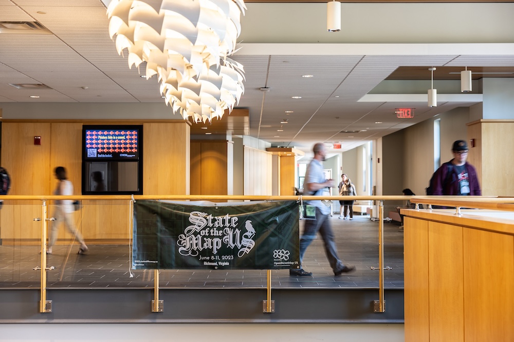
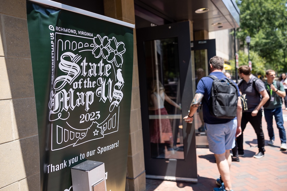
In 2023 I was lucky enough to lead the logo design for the best party in mapping: State of the Map US. The result, in the words of one RVA local, is “just so Richmond”.
In a departure from most prior State of the Map US logos, the conference team opted for a monochrome design. The intent was to have something versatile that operated well in different contexts and different colors, and would look sleak on a shirt without using as much plastic ink.
Richmond is one of the most-tattooed cities in the US, so we decided to draw inspiration from classic tattoo art with an incised blackletter font. The raven nods to the classic work of onetime Richmond resident Edgar Allen Poe and adds to the gothic feel.
The logo is framed by the iconic A-Line Bridge and its reflection in the James River. Dogwoods, the state flower of Virginia, give a springtime flourish.
And of course our logo wouldn’t be complete without a map element, so we have the outline of Virginia (including the Eastern Shore!) with the capital star over Richmond.
Photo gallery


Photos by Parker Michels-Boyce for OpenStreetMap US.
