Keeping the map iconic
While I was a full-time maintainer of iD (the default editor at osm.org/edit), I designed over 270 preset icons. Presets are the default feature types such as “Coffeehouse” or “Foot Path” that people can add to OpenStreetMap using iD. Good preset icons keep the app approachable for new mappers while helping power-mappers sift through data. Plus I think bespoke icons make the map look pretty sharp.
My icons live in the Temaki icon library, which is licensed in the public domain and can be used by anyone. My contributions represent more than half of this library.


Cultivating a design language
A consistent design language helps users to make inferences and catch distinctions between icons. When possible, I designed related icons as a series to highlight commonalities.


Gathering inspiration
Temaki is part of a rich history of freely licensed map iconography. Some of my designs didn’t start from scratch, but were inspired by elements from the likes of National Park Service, OSM Carto, Maki, and other Temaki contributors (shoutout to Bryan Housel!)


Representing map features
Since iD supports a vast number of feature types, I often ended up using literal representations of objects rather than abstraction or analogy.
For example, the default barrier icon in iD is a plain ⛔︎ no entry symbol. This is highly abstract and doesn’t tell you much about the real-world nature of the barrier. So, I designed a slew of descriptive icons that show each type of barrier as if you’re viewing it at ground level.


Distinguishing similar features
iD has a lot of similar-sounding presets that trip up new mappers. What’s the difference between an island and an islet? I created unique icons for confusingly similar features to help mappers decide which one is a better match.


Illustrating jargon
Detailed mapping requires a lot of specialized knowledge about what things are and what they’re called. I drew illustrative icons for niche feature types to help new mappers tag them correctly even if they’ve never heard the word “cairn” or “gantry”. These icons are especially helpful for non-English speakers since the preset labels in iD may not be fully translated.


Achieving legibility
The primary design constraint of map icons is legiblilty at small display sizes. The smaller your icons can be, the higher density of information you can convey.
Temaki icons are designed to be displayed at a minimum of 15x15 pixels. To achieve readable icons at this size, I aligned icon elements to a pixel grid and rarely used shapes smaller than one pixel in size.


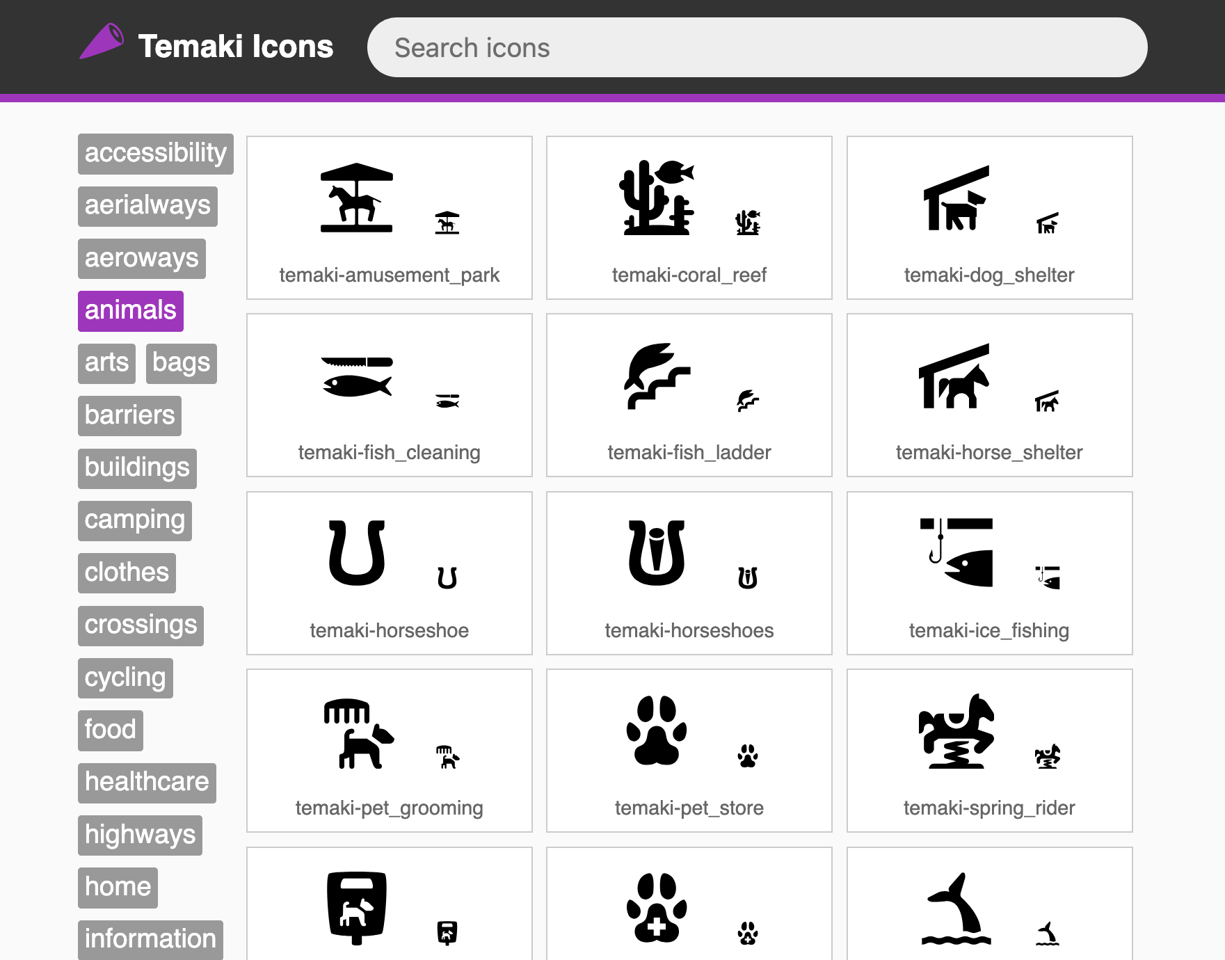
Browsing the library
In addition to contributing icons, I also built a preview webpage for the Temaki library. Users can filter icons by category and search them by name.